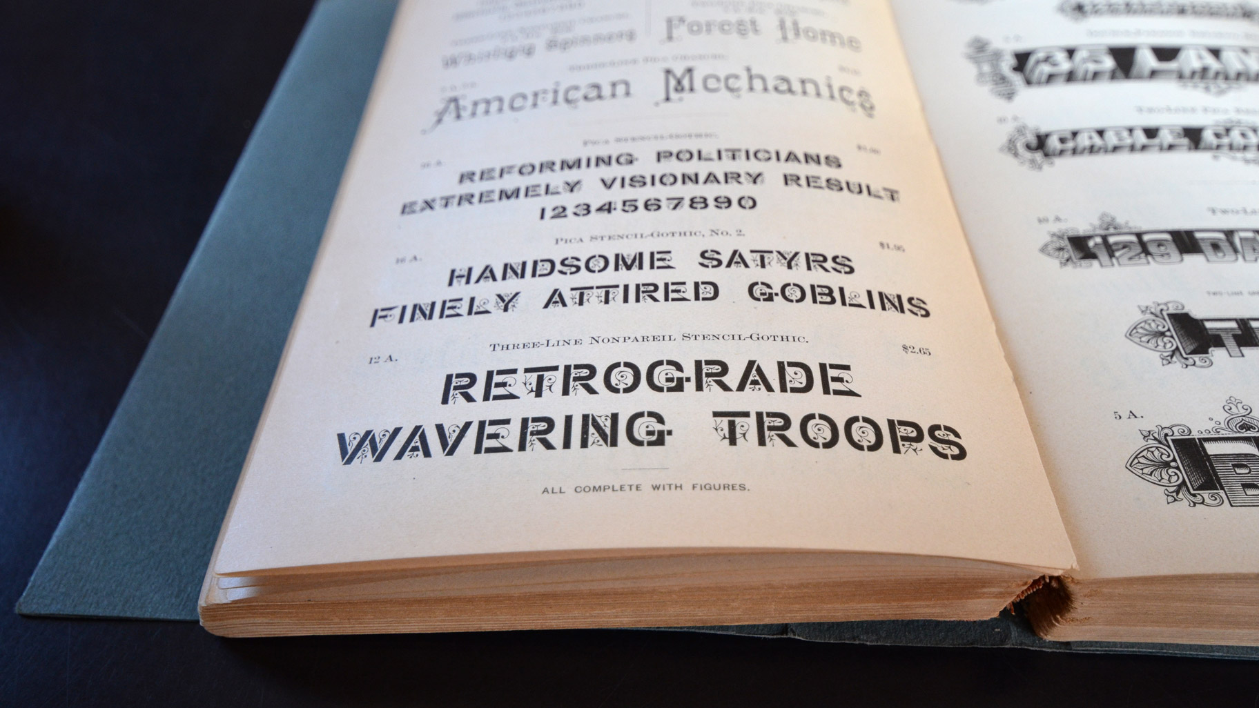
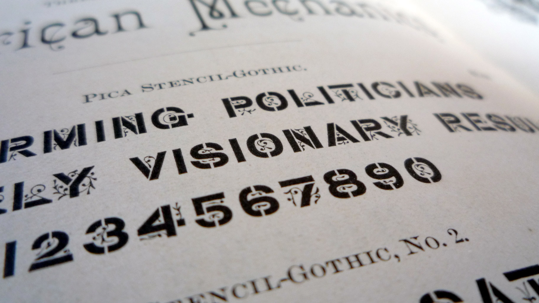
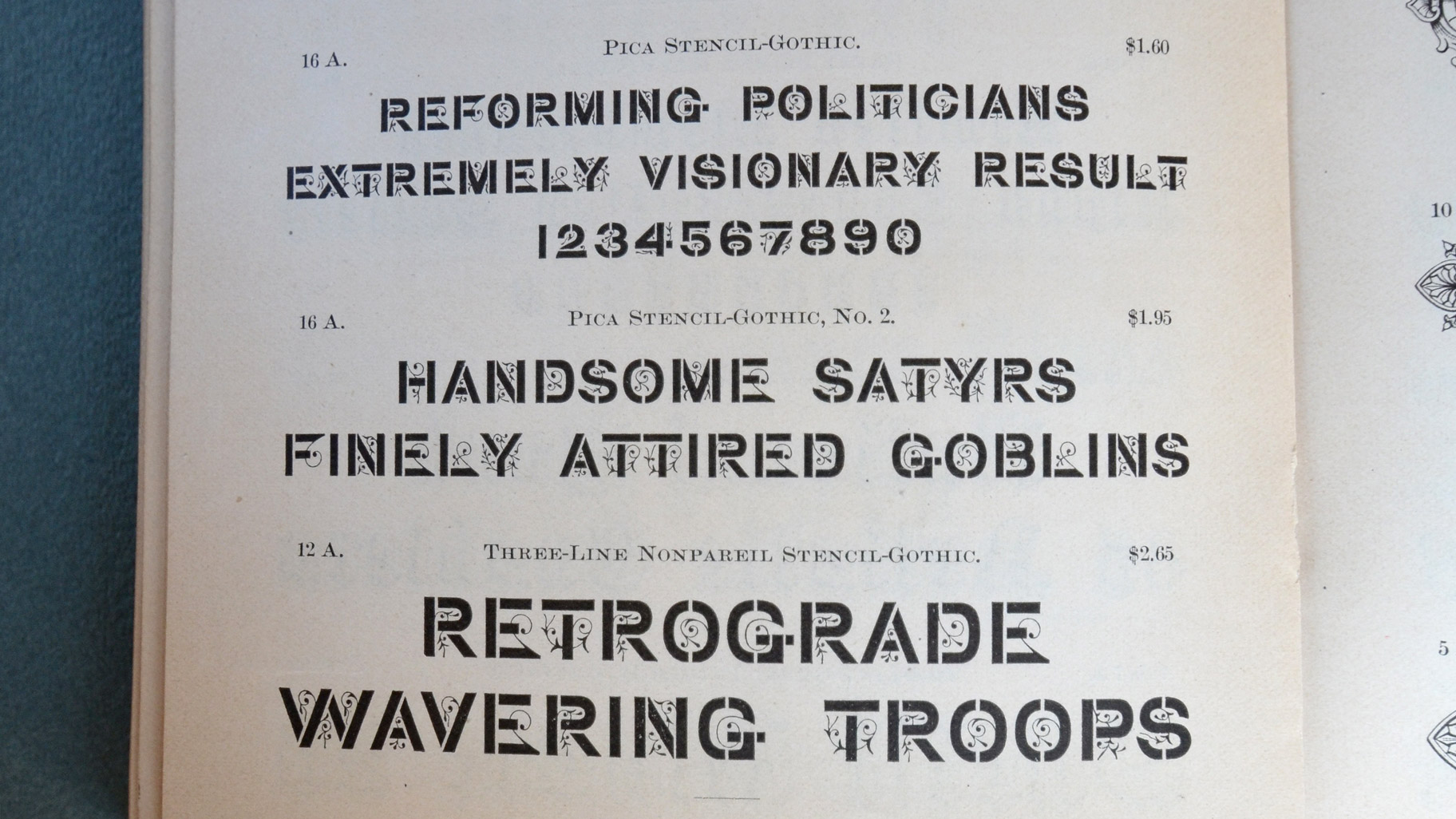
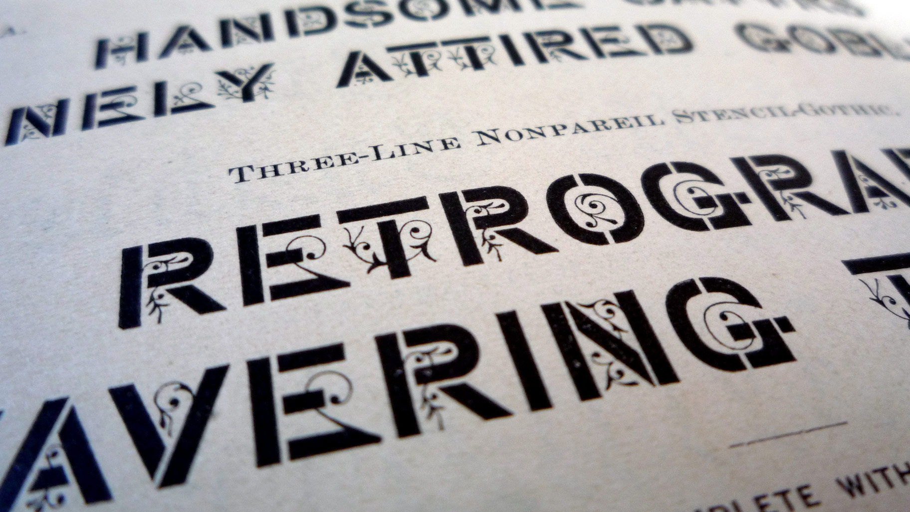
Stencil-Gothic — designed and registered at the US-patent office in 1885 by John West of Brooklyn, New York — is the first known typeface that incorporates the stylistic feature of interrupted strokes in order to evoke the impression of stencil lettering.
The translation of a structural essentiality from one reproduction method into another is a fascinating semiotic stunt. Within the realms of typography the gaps of the stencil letter lose all their functional imperative — bare of its technical necessity they turn into pure patina. Skeuomorphisms like that are omnipresent in the field of typography, where the appropriative embodiment of aesthetic aspects is inherent practice from its very origin — if not by definition.
In addition to the implementation of the stencil breaks into lead type the inventor of Stencil-Gothic seasoned its glyphs with “fey, budding tendrils that sprout from the letters […]”.* This coup totally subverts the technical limitations found in stencilling and leads to a design of vast conceptual complexity — a typeface flourishing with attractive contradictions and all the sparkle of
Victorian Eclecticism.
Historical research
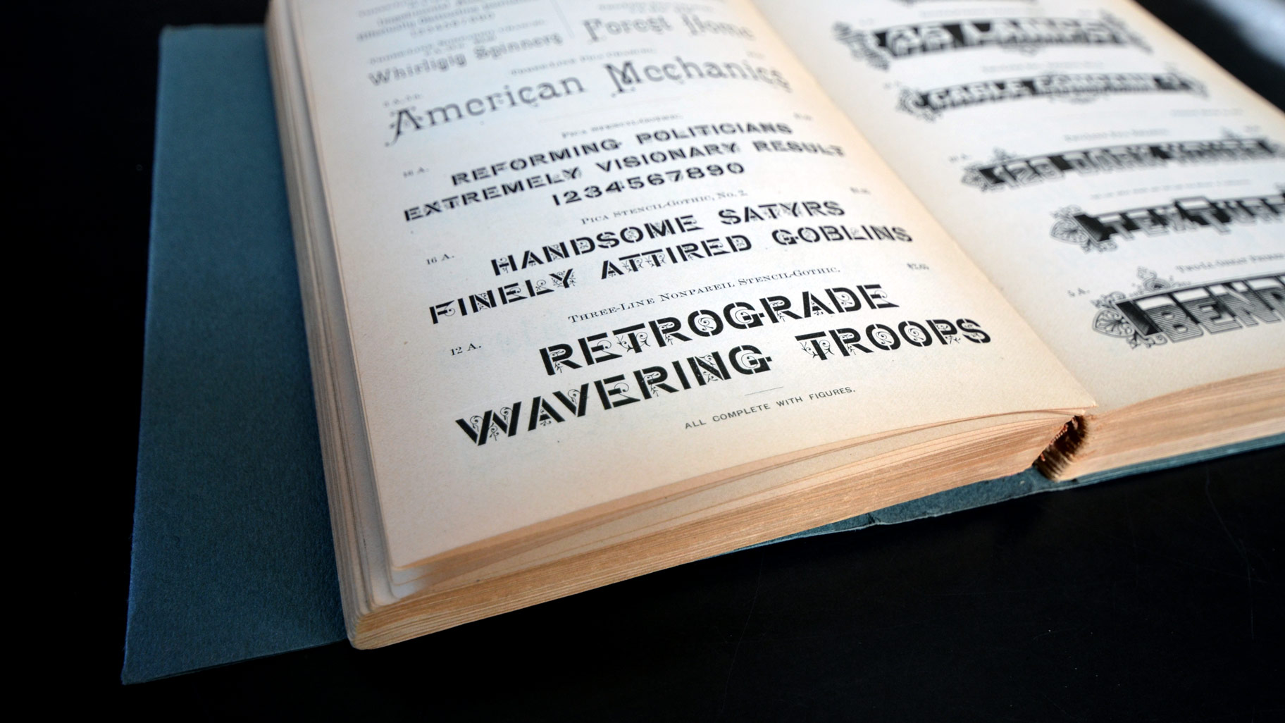
Stencil-Gothic appeared for the first time in the “Eleventh Book of Specimens of printing types and every requisite for typographical use and adornment” issued in 1885 by the Philadelphia-based type foundry MacKellar, Smiths & Jordan. In the following years it was also offered by Shniedewend, Lee & Co. of Chicago as well as Barnhart, Brothers & Spindler of Chicago — in the later under the name “Cleft Gothic”. The available sizes where relatively small — regarding the amount of detailing — covering 10 pt. (on a 12 pt. body), 12 pt. and 18 pt.
The patent
In the high times of American type founding patenting single typeface designs was of an outmost necessity in order to prevent piracy from rivaling foundries. The patent declaration for Stencil-Gothic — US-Patent No. 15,965 dated March 10, 1885 — is reproduced here in full for its poetic and imaginative value.
To all whom it may concern:
Be it known that I, JOHN WEST, of Brooklyn, Kings county, NewYork, have invented and produced a new Design for a Font of Printing-Type, of which the following is a specification.
The nature of my design is clearly shown in the accompanying typographic impression, to which reference is made; and it consists of a letter of the Gothic character ornamented by a light groundwork of curved-line character. The cross-strokes of the letters are separated from the vertical or up-and-down strokes, and the rounding letters are characterized by the openings, so that the appearance of stencil work results.
The character of the design is preserved in the numerals and in the interrogation-mark.
I claim as new—
The design for a font of printing-type, as shown and set forth.
Fascinated by the odd stylistic mixture found in its lettershapes Johannes Lang and Ellmer Stefan set out to digitize Stencil-Gothic in spring 2014.
In order to emphasize the polystylistic nature of the design the main strokes of the letters where deliberately drawn crude and orthogonal in contrast to the encapsulated flourishes, which where given a more soft and dynamic curve treatment. The differences in detailing found in the ornamentation of the three optical sizes made it necessary to balance between adaptation and interpretation as well as decide whether residues from letterpress printing shall be integrated or omitted.
The digital version remains caps-only — yet its character set was extended for contemporary needs and covers the most common languages using the latin alphabet.
Stencil-Gothic is available as a cross-platform compatible OpenType font as well as all common webfont formats for self-hosting. The purchased license covers the use as a desktop font on a specified number of computers (CPUs) and the embedding as webfont for one domain plus all its subdomains with prices as follows: